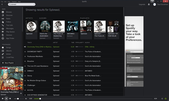
Spotify has a new design/interface.
The gray with green elements is now dark-gray/with white elements.
The fonts are bigger which means that you will see less on a smaller screen (14-15 inches from a laptop).
The elements and their position are the same. The same left panel with playlists and other tools, the main window with the songs.
Other than that, the Spotify client is pretty much the same as before.
Good or bad change?
It looks fancier now, more like a dj panel. The only bad thing is that on smaller screens, you will see less and you will scroll more.
There is no option to roll back to the old theme which would have been awesome.
What is your opinion?
